Brand assets
The ARtho Move brand, ready to use.
Our logo, colours and type, for press, clinics, partners and anyone else showing our name. Please use these files as they are.
The logo
A camera sees a body move.
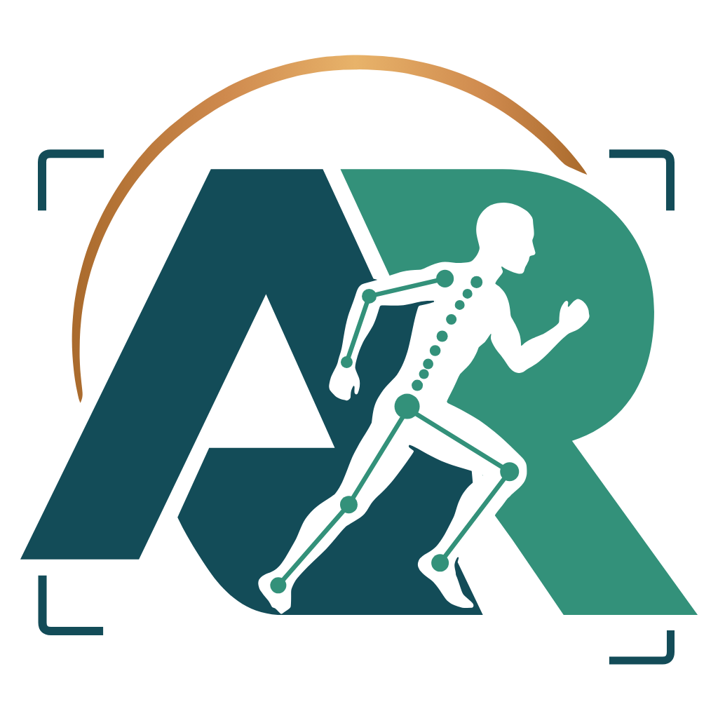
The letters A and R, with a runner cut through them and the joints a camera tracks marked on the body. A sunrise arc rises above, and camera corners frame it all. It says what ARtho Move does: it follows how a body moves and measures the recovery.
Versions
Four versions, one for each space.
Pick a background to see the right file for it. The links under each logo follow your choice.
The primary logo. Use this one unless there is a reason not to.
For square spaces such as posters and social images.
Where people already know the brand: app icon, favicon, stickers.

Where the symbol already appears nearby.

The kit also holds teal-only and white-only files for single-ink printing, embroidery and engraving, plus favicons and app icons.
Clear space
Half a letter of room on every side.
Keep a clear zone around the logo equal to half the height of the A in the name. Text, edges and other logos stay out of it. It scales with the logo, so never measure it as a fixed distance.
Minimum size
Never smaller than this.
Shown at the real on-screen size. Below 64 px or 20 mm, use the small cut of the symbol. It drops the skeleton and corners, which are too fine to survive at that size.
Screen 140 px wide · print 30 mm wide
Screen 110 px wide · print 28 mm wide
Screen 64 px · print 20 mm

Screen 16 px · print 6 mm
Misuse
Please don’t change the logo.
A consistent logo is how people learn to recognise us. These are the mistakes to avoid.
Colour
Deep teal and oat.
Select a colour to copy its HEX code. The amber tones make the logo’s sunrise arc. For small text on light backgrounds, use the darker #8a5420.
CMYK values are converted from screen colour, so treat them as a starting point. Match them to a printed swatch book before the first print run.
Typography
Two typefaces, both free.
Both are free for commercial use under the SIL Open Font License. If they aren’t available, use Georgia for headlines and your system’s sans serif for body text.
Page headline
Fraunces 600 · 36–64 px · line height 1 · spacing −3%
Section headline
Fraunces 600 · 28–46 px · line height 1.05 · spacing −2.5%
Body text sets out the point plainly, in sentences a patient and a physiotherapist can both follow.
DM Sans 400 · 16 px · line height 1.5
Small label
DM Sans 500 · 12 px · capitals · spacing +8%
Our name
How to write about us.
Two capitals, then a space. The short description is ready to use in an article, a partner page or an event listing.
ARtho Move
- Artho Move
- ArthoMove
- ARTHO MOVE
- Arthro Move
Short description
ARtho Move is a rehab adherence platform. Physiotherapists prescribe a home programme, the patient’s phone camera measures each repetition by joint angle, and the results go back to the clinic. No video or photo is recorded. ARtho Move is a rehab coaching aid, not a medical device.
- Health claims: never say ARtho Move diagnoses, treats or prevents a condition.
- Privacy: say “No video or photo is recorded.” and “Patient records stay in the country where care is delivered.”
Everything in one download.
Using our logo doesn’t mean we endorse you, so please ask before placing it beside your own brand. For that, or for a format that isn’t here, write to rishyak@arthomove.com.